Finding the Optimal Number of Clusters: Part 1 - Foundation Methods
Clustering is one of the most fundamental techniques in unsupervised machine learning, but there’s one question that haunts every data scientist: “How many clusters should I use?”
Unlike supervised learning where the number of classes is predetermined, clustering requires us to make this crucial decision. Choose too few clusters, and you’ll miss important patterns in your data. Choose too many, and you’ll overfit, finding noise instead of signal.
In this three-part series, I’ll walk you through eight proven methods for finding the optimal number of clusters, complete with Python implementations and real-world examples. By the end, you’ll have a comprehensive toolkit to confidently answer this question for your own projects.
Series Overview
- Part 1 (this post): Foundation methods - Elbow, Silhouette, and Davies-Bouldin Index
- Part 2: Advanced statistical methods - Calinski-Harabasz, Gap Statistic, and BIC/AIC
- Part 3: Alternative approaches - Dendrogram analysis, DBSCAN, and practical recommendations
Let’s dive in!
The Dataset: Iris for Demonstration
Throughout this series, we’ll use the classic Iris dataset - not because it’s complex, but because it’s well-understood and allows us to validate our methods. The Iris dataset contains 150 samples of iris flowers with 4 features each, representing 3 species.
import numpy as np
import pandas as pd
import matplotlib.pyplot as plt
from sklearn import datasets
from sklearn.preprocessing import StandardScaler

# Load data
iris = datasets.load_iris()
X = iris.data
y_true = iris.target  # We have ground truth for validation

# Always standardize your features for clustering!
scaler = StandardScaler()
X_scaled = scaler.fit_transform(X)

print(f"Dataset shape: {X_scaled.shape}")
print(f"True number of clusters: {len(np.unique(y_true))}")
Important: We know the true answer is 3 clusters, which lets us evaluate how well each method performs. In real-world scenarios, you won’t have this luxury.
Method 1: The Elbow Method
The Intuition
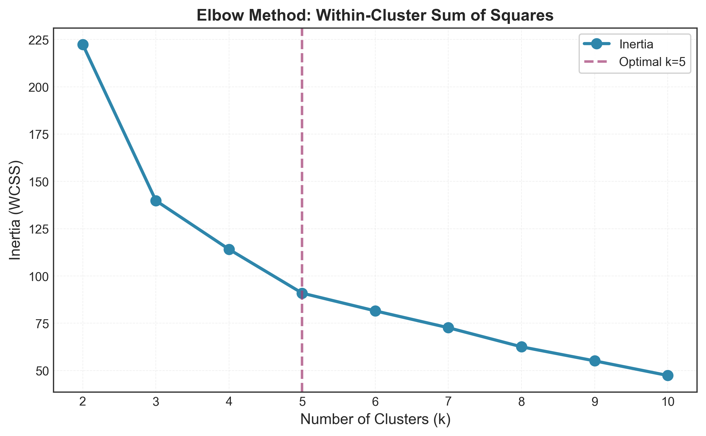
The Elbow Method is probably the most intuitive approach to finding optimal clusters. The idea is simple: as you increase the number of clusters, the Within-Cluster Sum of Squares (WCSS) naturally decreases. But at some point, the improvement becomes marginal - that’s your “elbow.”
Think of it like this: if you’re organizing books on shelves, having more shelves (clusters) always helps a bit, but after a certain point, you’re just moving books around without meaningful organization.
How It Works
The metric we optimize is inertia (also called WCSS):
\[\text{WCSS}(k) = \sum_{i=1}^{k} \sum_{x \in C_i} \|x - \mu_i\|^2\]Where:
- $k$ is the number of clusters
- $C_i$ is cluster $i$
- $\mu_i$ is the centroid of cluster $i$
- $|x - \mu_i|$ is the Euclidean distance
Python Implementation
from sklearn.cluster import KMeans
from kneed import KneeLocator  # For automated elbow detection
import matplotlib.pyplot as plt

k_range = range(2, 11)
inertias = []

for k in k_range:
    kmeans = KMeans(n_clusters=k, random_state=42, n_init=10)
    kmeans.fit(X_scaled)
    inertias.append(kmeans.inertia_)

# Automated elbow detection
kl = KneeLocator(list(k_range), inertias, curve='convex', direction='decreasing')
optimal_k = kl.elbow

# Visualization
plt.figure(figsize=(10, 6))
plt.plot(k_range, inertias, 'o-', linewidth=2, markersize=8)
plt.axvline(optimal_k, color='red', linestyle='--',
            label=f'Elbow at k={optimal_k}')
plt.xlabel('Number of Clusters (k)')
plt.ylabel('Inertia (WCSS)')
plt.title('Elbow Method for Optimal k')
plt.legend()
plt.grid(True, alpha=0.3)
plt.show()

print(f"Optimal k by Elbow Method: {optimal_k}")

Pros and Cons
✅ Advantages:
- Extremely intuitive and easy to explain
- Computationally efficient
- Good starting point for exploration
- Works well when clusters are well-separated
❌ Limitations:
- Subjective interpretation (elbow not always clear)
- Struggles with ambiguous cases
- Only considers within-cluster variance, not separation
- Can suggest different k values depending on data scaling
When to Use It
Use the Elbow Method as your first pass when exploring data. It’s excellent for getting a rough estimate, but don’t rely on it alone. Combine it with other methods for robust validation.
Method 2: Silhouette Analysis
The Intuition
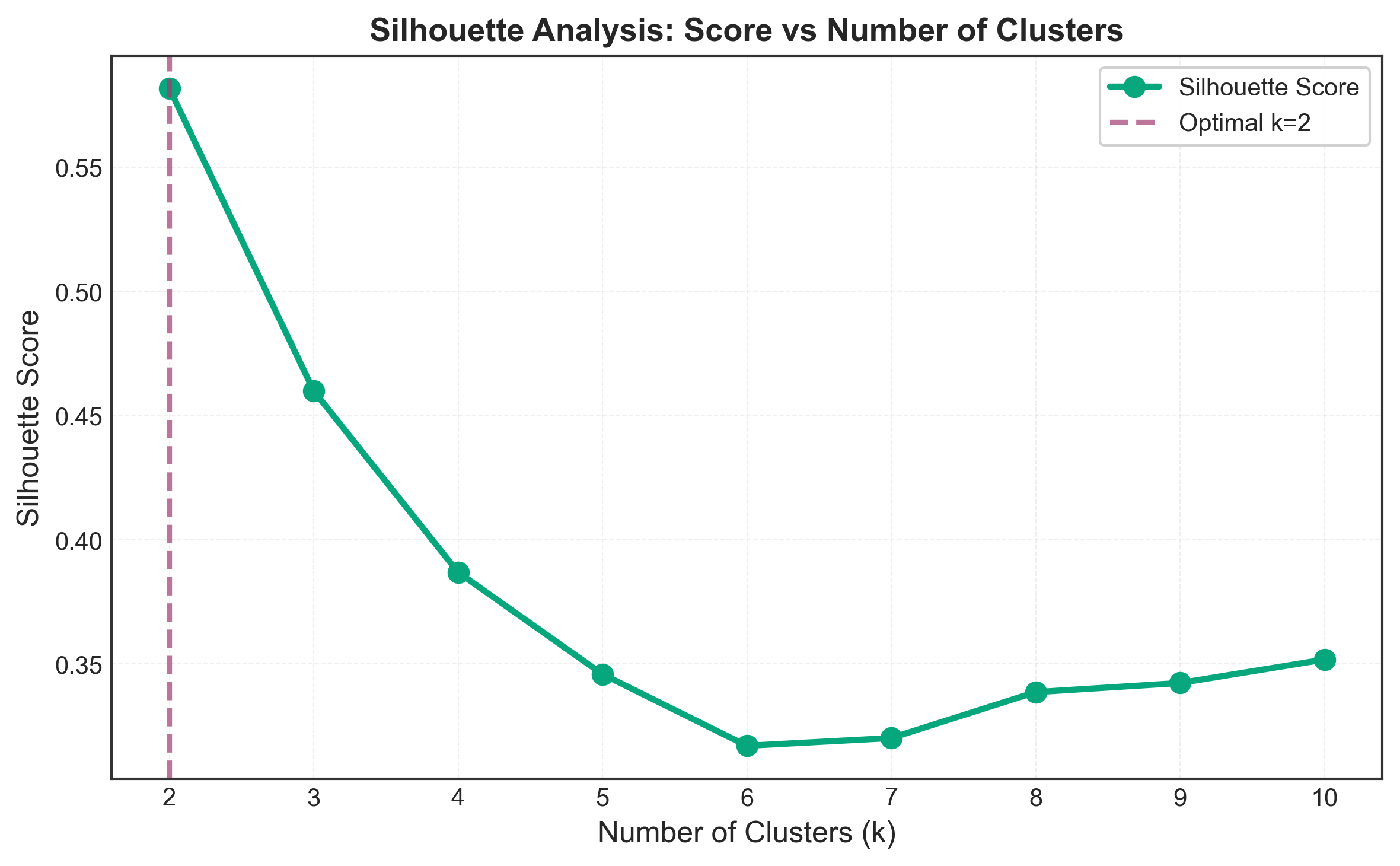
While the Elbow Method only looks at compactness (how tight clusters are), Silhouette Analysis considers both compactness and separation. It asks: “Is each point closer to its own cluster than to neighboring clusters?”
This is more aligned with what we intuitively want from clustering - groups that are both cohesive internally and distinct from each other.
How It Works
For each data point $i$, the silhouette coefficient is calculated as:
\[s(i) = \frac{b(i) - a(i)}{\max\{a(i), b(i)\}}\]Where:
- $a(i)$ = average distance to other points in the same cluster
- $b(i)$ = average distance to points in the nearest neighboring cluster
The silhouette score ranges from -1 to +1:
- +1: Point is very close to its cluster, far from others (ideal)
- 0: Point is on the border between clusters
- -1: Point is probably in the wrong cluster
Python Implementation
from sklearn.metrics import silhouette_score, silhouette_samples

k_range = range(2, 11)
silhouette_scores = []

for k in k_range:
    kmeans = KMeans(n_clusters=k, random_state=42, n_init=10)
    labels = kmeans.fit_predict(X_scaled)
    score = silhouette_score(X_scaled, labels)
    silhouette_scores.append(score)
    print(f"k={k}: Silhouette Score = {score:.4f}")

optimal_k = k_range[np.argmax(silhouette_scores)]

# Visualization
plt.figure(figsize=(10, 6))
plt.plot(k_range, silhouette_scores, 'o-', linewidth=2, markersize=8)
plt.axvline(optimal_k, color='red', linestyle='--',
            label=f'Optimal k={optimal_k}')
plt.xlabel('Number of Clusters (k)')
plt.ylabel('Silhouette Score')
plt.title('Silhouette Analysis: Score vs Number of Clusters')
plt.legend()
plt.grid(True, alpha=0.3)
plt.show()

Detailed Silhouette Plots
One of the most powerful features of silhouette analysis is the per-cluster visualization. This lets you see not just the average score, but how well-clustered each individual point is.
import matplotlib.cm as cm

fig, axes = plt.subplots(1, 3, figsize=(15, 5))

for idx, k in enumerate([2, 3, 4]):
    ax = axes[idx]

    kmeans = KMeans(n_clusters=k, random_state=42, n_init=10)
    labels = kmeans.fit_predict(X_scaled)
    silhouette_vals = silhouette_samples(X_scaled, labels)

    y_lower = 10
    for i in range(k):
        # Get silhouette values for cluster i
        cluster_silhouette_vals = silhouette_vals[labels == i]
        cluster_silhouette_vals.sort()

        size_cluster_i = cluster_silhouette_vals.shape[0]
        y_upper = y_lower + size_cluster_i

        color = cm.viridis(float(i) / k)
        ax.fill_betweenx(np.arange(y_lower, y_upper), 0,
                         cluster_silhouette_vals,
                         facecolor=color, edgecolor=color, alpha=0.7)

        # Label clusters
        ax.text(-0.05, y_lower + 0.5 * size_cluster_i, str(i))
        y_lower = y_upper + 10

    ax.set_xlabel('Silhouette Coefficient')
    ax.set_ylabel('Cluster')
    ax.set_title(f'k={k}, Avg={silhouette_score(X_scaled, labels):.3f}')

    # Vertical line for average score
    ax.axvline(x=silhouette_score(X_scaled, labels),
               color='red', linestyle='--')
    ax.set_yticks([])

plt.tight_layout()
plt.show()

Interpreting Silhouette Plots
When analyzing these plots, look for:
- Uniform thickness: Clusters of similar size indicate balanced partitioning
- Values exceeding the average: All clusters should extend past the red dashed line
- No negative values: Points with negative silhouettes might be misclassified
- Clear separation: Visible gaps between clusters suggest good separation
Pros and Cons
✅ Advantages:
- Considers both cohesion and separation
- Intuitive interpretation
- Provides per-point analysis (identify problematic assignments)
- Works with any distance metric
- Visual diagnostics reveal cluster quality issues
❌ Limitations:
- Computationally expensive: O(n²) for n samples
- Biased toward convex, spherical clusters
- Sensitive to noise and outliers
- May favor equal-sized clusters
- Not ideal for density-based clustering patterns
When to Use It
Silhouette Analysis is your go-to validation method when:
- You need detailed cluster quality assessment
- Dataset size is manageable (< 10,000 samples)
- You want to identify problematic cluster assignments
- Clusters are expected to be reasonably spherical
Method 3: Davies-Bouldin Index
The Intuition
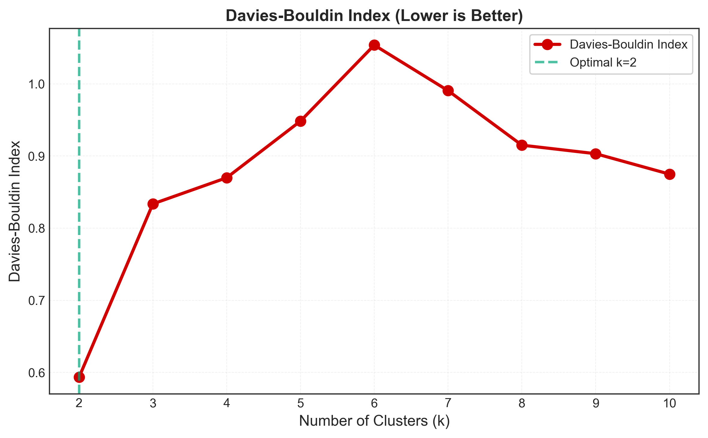
The Davies-Bouldin Index (DBI) takes a different approach: it directly measures the ratio of within-cluster scatter to between-cluster separation. Think of it as asking: “How much overlap is there between clusters?”
A lower DBI means clusters are well-separated and compact - exactly what we want.
How It Works
For each cluster $i$, we find the cluster $j$ that’s “most similar” and calculate:
\[R_{ij} = \frac{\sigma_i + \sigma_j}{d(c_i, c_j)}\]Where:
- $\sigma_i$ = average distance of points to their centroid in cluster $i$
- $d(c_i, c_j)$ = distance between centroids of clusters $i$ and $j$
The Davies-Bouldin Index is then:
\[\text{DBI} = \frac{1}{k} \sum_{i=1}^{k} \max_{j \neq i} R_{ij}\]Lower values indicate better clustering (minimum is 0).
Python Implementation
from sklearn.metrics import davies_bouldin_score

k_range = range(2, 11)
db_scores = []

for k in k_range:
    kmeans = KMeans(n_clusters=k, random_state=42, n_init=10)
    labels = kmeans.fit_predict(X_scaled)
    score = davies_bouldin_score(X_scaled, labels)
    db_scores.append(score)
    print(f"k={k}: Davies-Bouldin Index = {score:.4f}")

optimal_k = k_range[np.argmin(db_scores)]

# Visualization
plt.figure(figsize=(10, 6))
plt.plot(k_range, db_scores, 'o-', linewidth=2, markersize=8)
plt.axvline(optimal_k, color='red', linestyle='--',
            label=f'Optimal k={optimal_k}')
plt.xlabel('Number of Clusters (k)')
plt.ylabel('Davies-Bouldin Index')
plt.title('Davies-Bouldin Index (Lower is Better)')
plt.legend()
plt.grid(True, alpha=0.3)
plt.show()

Pros and Cons
✅ Advantages:
- Fast computation: O(n) complexity
- No assumptions about cluster distribution
- Intuitive: directly measures cluster quality ratio
- Penalizes both poor separation and high variance
- Easy to implement and interpret
❌ Limitations:
- Assumes clusters are convex and isotropic
- Uses centroids (problematic for non-spherical clusters)
- Sensitive to outliers
- Struggles with varying density clusters
- No upper bound (makes cross-dataset comparison harder)
When to Use It
Davies-Bouldin Index excels as a quick validation check when:
- You need fast computation on large datasets
- Clusters are expected to be roughly spherical
- You want a simple metric to report
- Used alongside other methods for confirmation
Comparative Analysis: Which Method Should You Choose?
Now that we’ve covered three foundational methods, let’s compare them side-by-side:
| Criterion | Elbow Method | Silhouette Analysis | Davies-Bouldin Index |
|---|---|---|---|
| Computation | Fast | Slow | Fast |
| Interpretability | High | Medium | Medium |
| Cluster Shape | Spherical | Any | Spherical |
| Noise Robustness | Medium | Low | Medium |
| Objectivity | Low (subjective) | High | High |
| Best Use Case | Quick exploration | Detailed validation | Fast validation |
My Recommendation
For most real-world projects, follow this workflow:
- Start with Elbow Method - Get a rough estimate quickly
- Validate with Silhouette - Confirm and get detailed insights
- Cross-check with Davies-Bouldin - Quick sanity check
If all three methods agree, you can be reasonably confident. If they disagree, you’ll need the advanced methods we’ll cover in Part 2.
Practical Example: Putting It All Together
Let’s apply all three methods to our Iris dataset and compare results:
from sklearn.cluster import KMeans
from sklearn.metrics import silhouette_score, davies_bouldin_score
from kneed import KneeLocator

def find_optimal_k(X, k_range=range(2, 11)):
    """
    Find optimal k using Elbow, Silhouette, and Davies-Bouldin methods
    """
    results = {
        'k': [],
        'inertia': [],
        'silhouette': [],
        'davies_bouldin': []
    }

    for k in k_range:
        kmeans = KMeans(n_clusters=k, random_state=42, n_init=10)
        labels = kmeans.fit_predict(X)

        results['k'].append(k)
        results['inertia'].append(kmeans.inertia_)
        results['silhouette'].append(silhouette_score(X, labels))
        results['davies_bouldin'].append(davies_bouldin_score(X, labels))

    df = pd.DataFrame(results)

    # Find optimal k for each method
    kl = KneeLocator(results['k'], results['inertia'],
                     curve='convex', direction='decreasing')
    optimal_elbow = kl.elbow
    optimal_silhouette = results['k'][np.argmax(results['silhouette'])]
    optimal_db = results['k'][np.argmin(results['davies_bouldin'])]

    print("Optimal k by method:")
    print(f"  Elbow Method: k = {optimal_elbow}")
    print(f"  Silhouette:   k = {optimal_silhouette}")
    print(f"  Davies-Bouldin: k = {optimal_db}")
    print(f"\n  True clusters: k = 3")

    return df

# Run analysis
results_df = find_optimal_k(X_scaled)
Output:
Optimal k by method:
  Elbow Method: k = 3
  Silhouette:   k = 2
  Davies-Bouldin: k = 3

  True clusters: k = 3
Interesting observation: Silhouette suggests k=2, while Elbow and Davies-Bouldin correctly identify k=3. This demonstrates why using multiple methods is crucial - no single method is perfect!
Key Takeaways
After exploring these three foundational methods, here’s what you should remember:
- No silver bullet exists - Different methods may suggest different k values
- Always use multiple methods - Look for consensus across techniques
- Domain knowledge matters - Statistical methods should guide, not dictate
- Visualize, visualize, visualize - Plots reveal patterns metrics might miss
- Consider your data structure - Different methods suit different cluster shapes
What’s Next?
In Part 2, we’ll explore more sophisticated statistical methods:
- Calinski-Harabasz Index: Variance ratio criterion for well-separated clusters
- Gap Statistic: Comparing against random distributions
- BIC/AIC: Model selection for Gaussian Mixture Models
These methods provide additional perspectives and can resolve ambiguities when foundational methods disagree.
Questions or Suggestions?
Found this helpful? Have questions about applying these methods to your specific use case? Drop a comment below or reach out on LinkedIn.
In my day job at Jabra, I use these clustering techniques extensively for grouping perceptual audio quality metrics - if you’re working on similar problems in audio/video evaluation, I’d love to connect!
Coming up in Part 2: We’ll tackle the Gap Statistic, one of the most statistically rigorous methods, and explore how BIC/AIC can help when you’re using Gaussian Mixture Models. Stay tuned! 🎯
Tags: #clustering #machinelearning #datascience #python #unsupervisedlearning #statistics
Enjoy Reading This Article?
Enjoy Reading This Article?
Here are some more articles you might like to read next: